Today, you’ll be tasked with creating some visualizations of a data set using matplotlib.
You will create a number of different visualizations, all based on the same csv data.
If matplotlib is not yet installed on your system, do so now.
Go to their website, and follow the installation instructions.
Once that is finished, you should download the data set from: https://think.cs.vt.edu/corgis/csv/billionaires/billionaires.html. After you download the data, you should remove the first line, which are the names of the columns. You can keep that web-page open to use as a schema reference. place this file in it’s own directory. In the programming problems, put your code in this same directory.
You should finish at least three of these problems, and submit your solution to D2L.
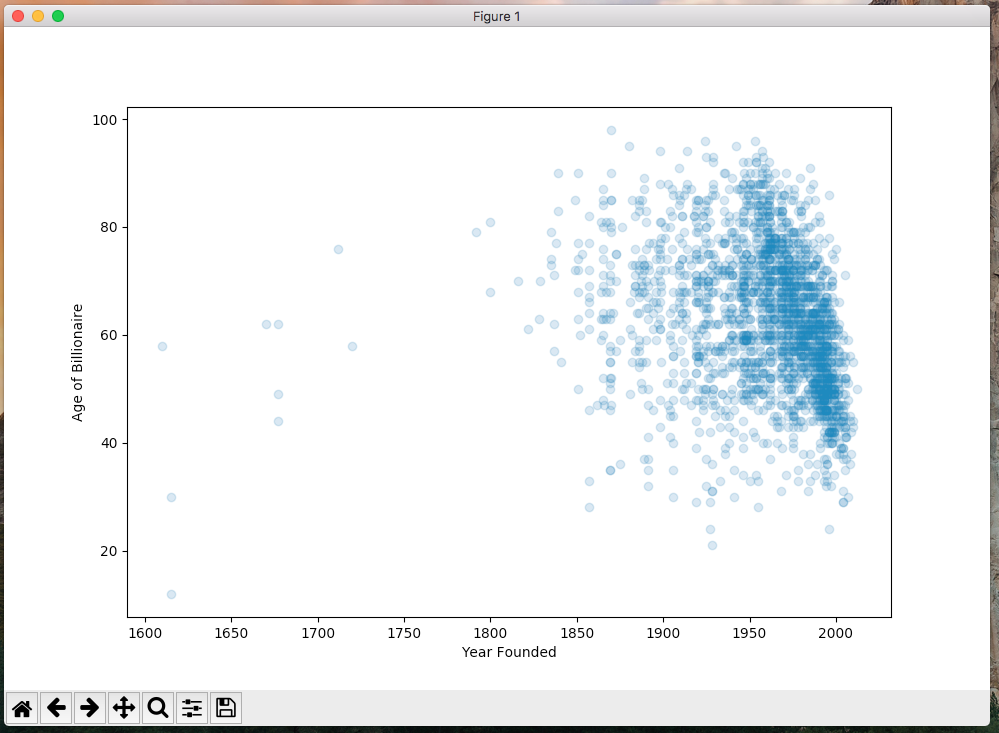
In this first problem, you should create a scatterplot based on the data.
Name this program b1.py.
Each dot should represent a billionaire in the data set.
The x-axis represents the year that their company was founded.
The y-axis represents the billionaires age.
You should make each dot transparent.
you will have to do a little bit of data cleaning.
Some of the ages are -1 (in the case where the age was unavailable), and some of the years are 0 (perhaps for the same reason).
The final product should look something like this:

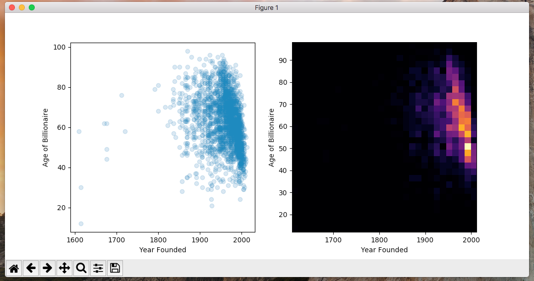
In this problem, you should add a second plot to the one you created in b1.py.
Name this second program b2.py, and start by copy/pasting the code from b1.py into it.
Using the same data, you should add a 2d histogram.
The final product should look similar to the below image:
In this problem, you should modify the vis you created in b1.py.
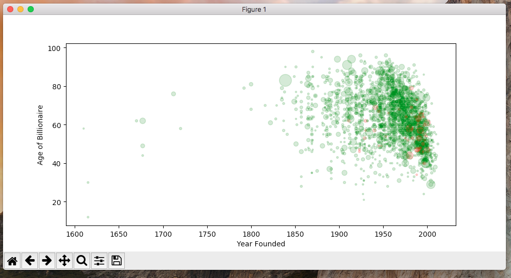
Name this program b3.py, and start by copy/pasting the code from b1.py into it.
You should modify it in two ways:
The result should resemble the following:
In this problem, you will visualize some different data.
Call your program b4.py.
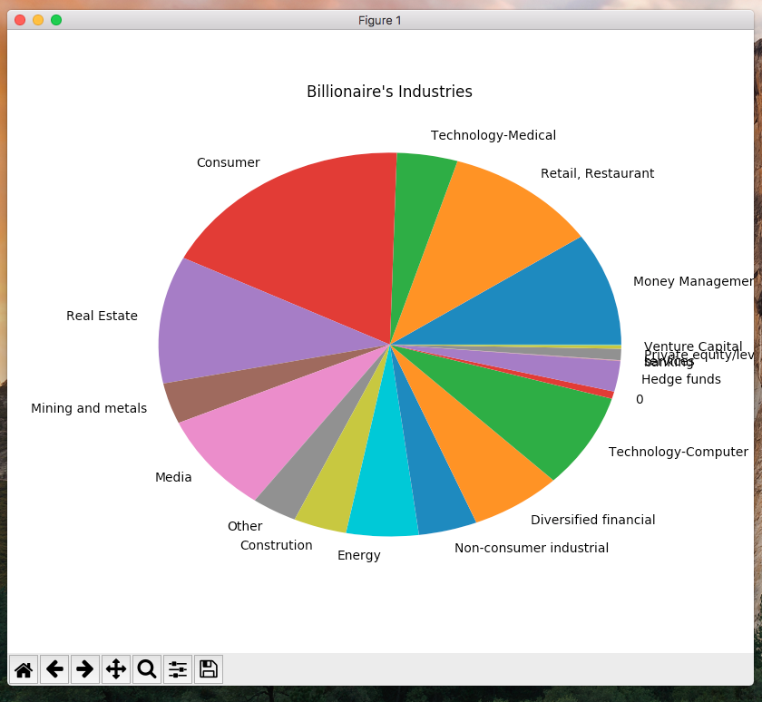
You should create a pie-chart that shows the various industries that the billionaires are in.
You should use the matplotlib pie chart functionality to accomplish this.
To accomplish this, you should create two “parallel” lists.
The first will have the names of each category and the second will have the counts of each category.
You can then pass these to the pie function within matplotlib to get the pie chart to display.
The result should resemble the following:
In this problem, you will add to the visualization from problem 4.
Call your program b5.py, and copy in the code from b4.py as a starting point.
The final result should look similar to the vis below.
In particular, you are adding tow additional pie-charts to the figure.
The other two depict the billionaires’ region and citizenship.
