The final project is here!
In this project, you may work on your own or in groups of two. The choice is yours, but you must let me know either way. Send me an email by 4/21 letting me know your choice. As you’ll see, there are extra requirements if you are doing this in a group.
There are many, many datasets out there on the internet that contain enormous amounts of potentially very useful information. The problem is that raw data files (csv, excel, html, etc) are not all that useful on their own. Manually parsing, and searching through these is a laborious task.

As scientists, we need tools to help us summarize, understand, and extract meaning from such data. In this project, we’ll be writing a tool to help solve this problem!
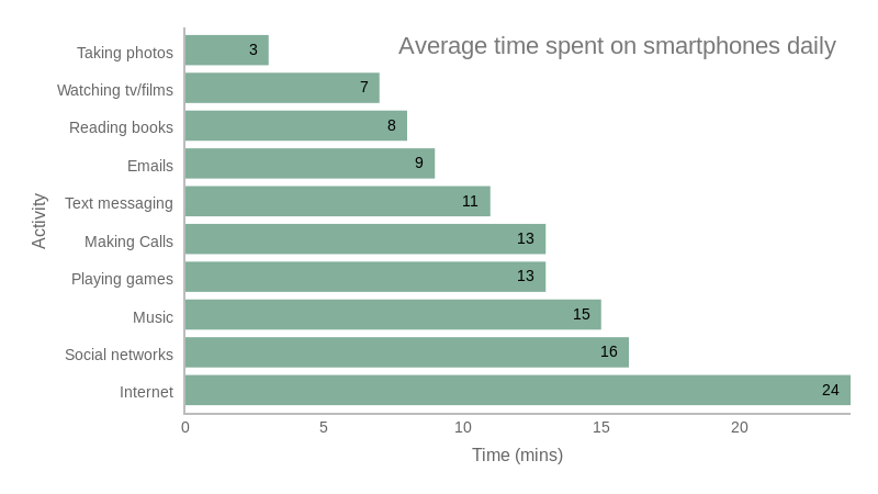
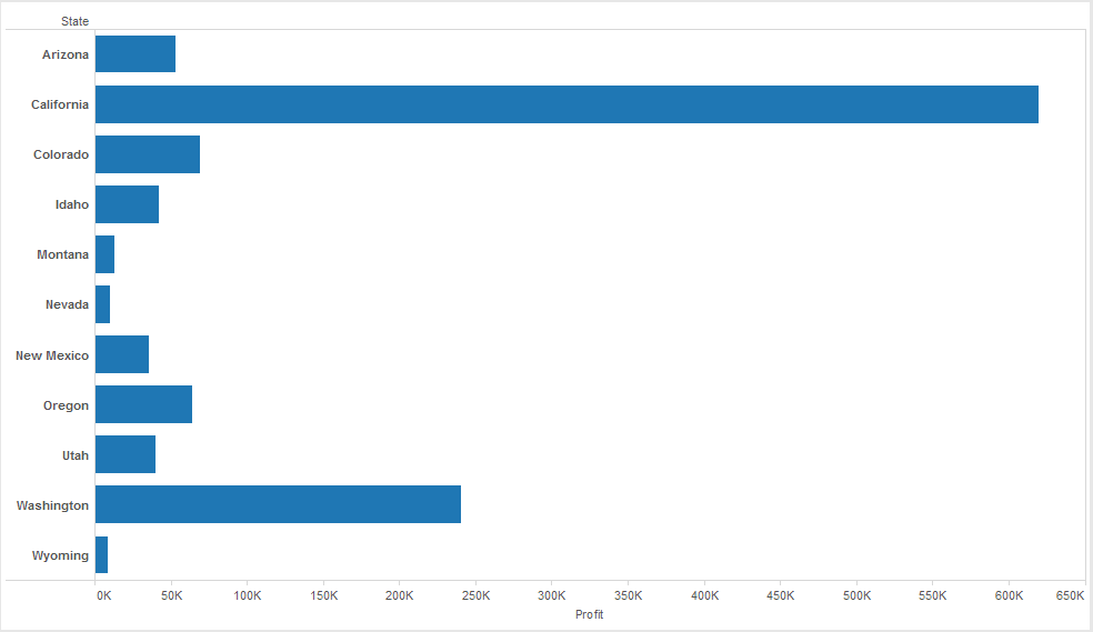
Most of us are familiar with bar charts. Typically, bar charts are used to correlate some type of categorical data on one axis with related numeric data on another. Below are a few examples I found on the internet.

In the above chart, the vertical (y) axis are a set of categories of what tasks people do with their smartphones. The horizontal (x) axis is the minutes spent doing each task.

In this chart, the vertical (y) axis are a set of states that a company sells product(s) in. The horizontal (x) axis is the sales profit for each state.
In this assignment, you will write a tool that generates bar-charts for arbitrary sets of tabular data! In this project, you will write a program that generated bar-charts from CSV data.
You will be writing a tool called inex.py (short for INformation EXtractor).
As the name implies, this tool will extract information from arbitrary sets of tabular data.
This tool is not designed to work on a specific data set.
Rather, it will be able to summarize and extract information from any well-formed CSV file.
This script will summarize information from CSV files by generating bar-charts for either individual columns or pairs of columns.
When run, the program will prompt the user for 3 peices of information. First, it asks the user for a data set (a csv file):
$ python3 inex.py
INEX: Set data source:
Here the user should type in the full path and name of the csv file for this program to process.
If the csv file is in the same directory as inex.py, just type the name of the file.
After specifying the file name, it will ask for the column(s) of the file you wish to process:
$ python3 inex.py
INEX: Set data source:
Diamond.csv
INEX: What column(s) would you like to summarize?
At this point, the user should type in either one or two column names.
If the user only wants to process one column, just the column name is typed.
If two columns will be processed, type both, separated by a vertical bar ( | ).
One column should look like:
INEX: What column(s) would you like to summarize?
carat
And two columns:
INEX: What column(s) would you like to summarize?
color | carat
INEX will use these one or two columns to determine which data it will plot. Lastly, INEX will ask if the user would like to generate a text or graphical plot:
INEX: What type of plot should be generated? (text or graphical)
Here, the user can type either text or graphical.
If text is specified, a text-based bar-chart will be printed.
If graphical is specified, it will generate a graphical plot using the same information.
More on these two plot types later…
inex.py should be able to work with any CSV file that uses commas as separators and where the first row has the names of the columns.
In this section and the following, we’ll use the Diamonds.csv data set from the page linked before with lot’s of CSV data sets.
This particular file has 308 lines and 5 columns. The first few lines look like:
"","carat","colour","clarity","certification","price"
"1",0.3,"D","VS2","GIA",1302
"2",0.3,"E","VS1","GIA",1510
"3",0.3,"G","VVS1","GIA",1510
"4",0.3,"G","VS1","GIA",1260
"5",0.31,"D","VS1","GIA",1641
...
Notice that the first row specifies the name of each of the remaining columns. All the rest of the columns represent rows of the CSV table. Thus, the first row represents the “schema” and all of the rest represent the “data”.
When you read in the csv file, you should strip all of the single-quotes ('), double-quotes (") and whitespace character from the beginning and end of the strings.
If only one column is specified by the user, INEX will generate a bar-chart in which:
When two columns are specified:
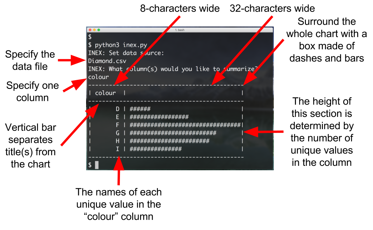
Below is a single-column example run using the same Diamond.csv file.
$ python3 inex.py
INEX: Set data source:
Diamond.csv
INEX: What column(s) would you like to summarize?
colour
INEX: What type of plot should be generated? (text or graphical)
text
---------------------------------------------
| colour  |                                 |
|-------------------------------------------|
|       D | ######                          |
|       E | #################               |
|       F | ################################|
|       G | #########################       |
|       H | #######################         |
|       I | ###############                 |
---------------------------------------------
Note the following characteristics of this bar-chart:

Here are some examples of a two-column bar chart:
$ python3 inex.py
INEX: Set data source:
Diamond.csv
INEX: What column(s) would you like to summarize?
colour | carat
---------------------------------------------
| colour  |              carat              |
|-------------------------------------------|
|       D | ###########################     |
|       E | ###########################     |
|       F | #########################       |
|       G | #########################       |
|       H | #############################   |
|       I | ################################|
---------------------------------------------
$ python3 inex.py
INEX: Set data source:
Diamond.csv
INEX: What column(s) would you like to summarize?
clarity | carat
---------------------------------------------
|clarity  |              carat              |
|-------------------------------------------|
|      IF | ###############                 |
|     VS1 | ###########################     |
|     VS2 | ################################|
|    VVS1 | ##########################      |
|    VVS2 | ############################    |
---------------------------------------------
The bars can be a maximum of 32 # characters wide (or some reasonable width, that will fit on the screen).
Obviously, The numeric values in the actual data column won’t usually be from 1-32.
Thus, the numeric values need to be “scaled” to be out of 32.
Doing this is similar to the single-column plot:
Note that we will not be testing this with diff-based auto-testing. Since the output of these bar-charts is so complex, we don’t want you to sink a lot of time into making sure the plots show up 100% like they do in these examples. We will be giving them the “eye-ball test.”
The graphical bar-chart option is only a required component for groups of two. If you are an individual working on this, no need to implement (but you may, just for fun).
If the user tells inex to generate a graphical chart, it will not print out the text plot described above.
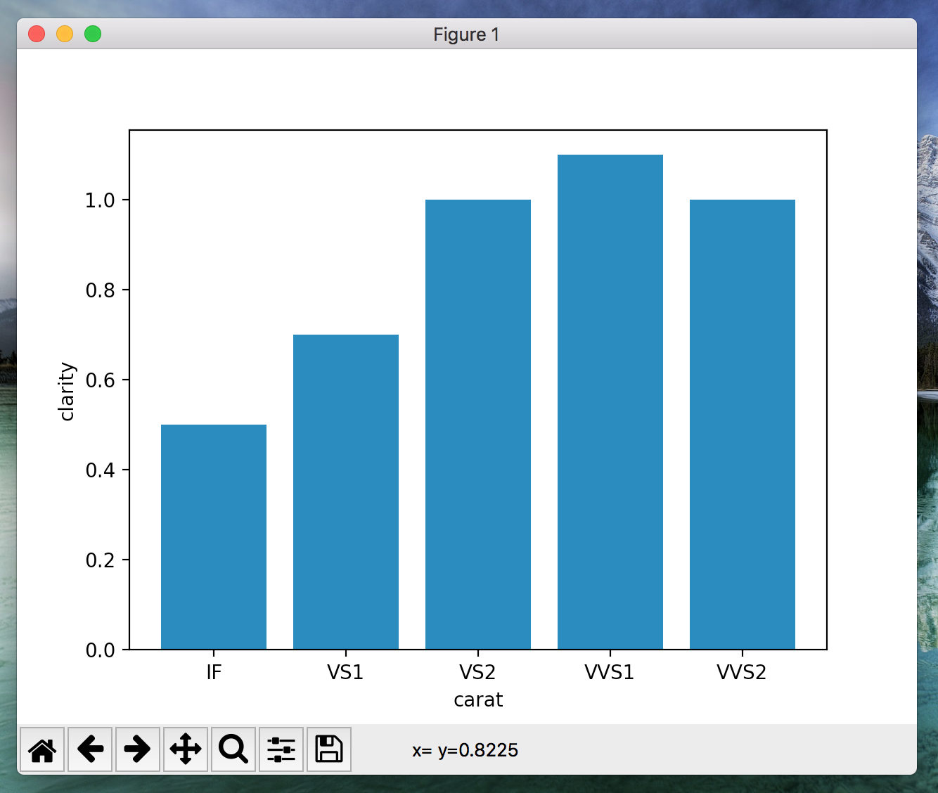
Instead, it will use the matplotlib library to generate a plot.
The plot should look like so:

You may use creative liberty with the plot (colors, size, font, etc), but it should still be an easy-to-understand bar chart.
The plot should function the same way that the text-based one does.
Note that we have not spent a lot of class time learning oubout matplotlib, so you may need to spend time on your own learning about it.
Use the following resources to get a jump-start:
Though really, all you need to know how to do is generate a bar-chart with matplotlib. Below is some example code demonstrating how to build a bar-chart with matplotlib:
### These commands import the numpy and matplotlib modules
### These two modules make creating graphical plots very easy in python!
import matplotlib.pyplot as plt; plt.rcdefaults()
import matplotlib.pyplot as plt
import numpy

### These are the "categories" of the bar-chart.
### You will tell the matplotlib module abotu these later.
### Put them into a tuple.
objects = ('IF', 'VS1', 'VS2', 'VVS1', 'VVS2')

### These are the numeric values that correspond to the "categories"
### You will tell the matplotlib module abotu these later.
### from the tuple above.
performance = [0.5, 0.7, 1.0, 1.1, 1.0]

### Dont worry too much about this line.
### Just know that you need to do this to make the bar-char sho up correctly.
bar_coords = numpy.arange(len(objects))

### This line "creates" the bar chart, give the data and parameters you desire
plt.bar(bar_coords, performance, align='center', alpha=1.0, tick_label=objects)

### Use these to specify the label for the x and y axes
### NOT REQUIRED. Will still work without these lines
plt.ylabel('clarity')
plt.xlabel('carat')

### Finally, tell matplotlib to display the bar chart.
plt.show()
You can use this code as a starting point, and adapt it to work inside of inex.py.
The matplotlib and numpy python packages generally do not come pre-installed with python.
You’ll need to download and install them separately to get this to work.
Since the output of this program is rather intricate, we will not be grading your assignment with precise and automated testing. If your spacing or plot alignment is a little bit off, no big deal. You may take some “creative liberty” with both the text and graphical plots. However, they must at least resemble the ones shown in this spec, and they must accurately plot the CSV data. You should also test your program with at least 2-3 other data sets from the linked website.
65% of your grade for this project comes from the program.
The other 35% will come from a summary report that you will write (But note, the report depends on implementing inex.py correctly, so you really can’t work on it until your code is working).
Choose one (or more) CSV file(s) (either from the linked site, or elsewhere) with at least 300 rows and 5 columns.
Spend some time both manually inspecting the data set and running inex.py in the data set to extract interesting correlations and results.
In the report, describe:
inex.py in this section.The report should be two pages, including the included diagrams (or more, if you want).
No funny business here to try to “stretch” your report to 2 pages (use 12pt font, single-spaced, reasoable sized diagrams, etc).
Write the report using your favorite document editor (Word, Google Docs, LaTeX, etc) and then save it to a PDF named inex-report.pdf.
Submit alongside your code.
Make sure to include a link to the data set you chose in your report.
If you are working in a group, both members must submit a separate report, with a separate data set.
Submit inex.py and inex-report.pdf to the D2L dropbox (no need to zip anything).
This is due May 3rd by 6:00pm.
You may not use any late days for this.